niche niche niche niche niche niche
niche niche niche niche niche niche
Buyer Trust
Visual Assets
Branding
Teamwork
Project Type: Website
Year: 2025
Software: Figma, Photoshop
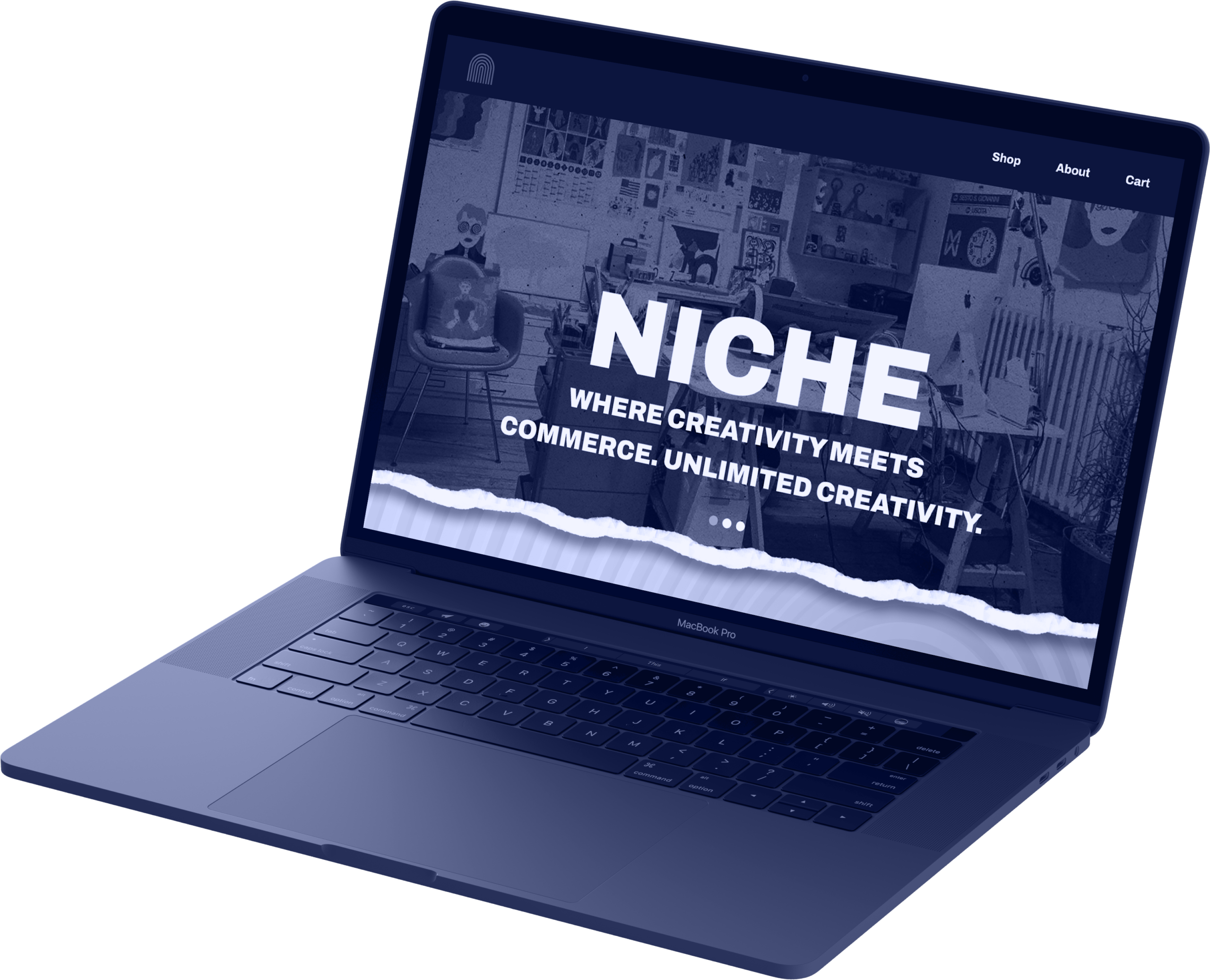
When people think about design in New Orleans, the first place their mind should go to is Niche! Opened by Loyola University New Orleans’ Design Department, Niche sells handmade goods by student and alumni designers. Previously selling items as a pop-up shop, they looked to expand their presence with an e-commerce site. Professor Daniela Marx, the founder of Niche, contacted our team for help with designing the site. We had to discover how to make an effective storefront that considered Niche's circumstances and expressed their unique brand identity.
research
Our team began by creating interview questions for a meeting with Professor Marx. We brainstormed questions individually before reviewing as a group, combining similar questions and choosing which to prioritize. Some questions that proved particularly useful were:
What type of aesthetic and feeling do you want the Niche website to convey?
What existing branding or marketing strategies are in place for Niche?
What are the primary goals, messages, and/or values of Niche?
client meeting
Using our interview questions, we gained clearer insight into Niche’s brand. Professor Marx envisioned a playful feel that used layering, pattern and texture. While Niche sells handmade products, she emphasized that Niche should feel high-end and contemporary: it's a design store, not another place to buy arts and crafts.
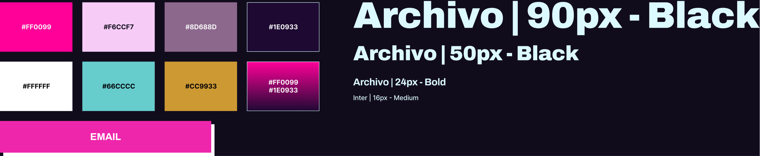
Niche already had a style guide with several logos, a color palette and a typeface. However, it was not made with web design in mind and we were encouraged to experiment with it as needed. Professor Marx also didn't have images for us to use, so we had to find appropriate placeholders.
Professor Marx wanted the brand to be positioned as a leader of design in New Orleans, appealing particularly to people connected to Loyola or visitors seeking a souvenir from the city. This meant that highlighting the Loyola designers and showing what makes New Orleans unique was critical.
With all this in mind, it became clear that Niche had specific needs that couldn't be fulfilled by selling on another site.
development
To explore site layouts and features, we individually created wireframes for each page. We then voted on the strongest elements from each design and combined them for our final layout.
My main contributions were the review and social media post sections. Since Niche didn't yet have a large audience, establishing trust with shoppers would be crucial. Seeing Niche's overall review score and other people posting with Niche products would make the brand feel reputable and established.
While we were concerned about the initial impact of a few negative reviews, we decided that the trust gained by positive reviews would make the risk worth taking.
moodboard
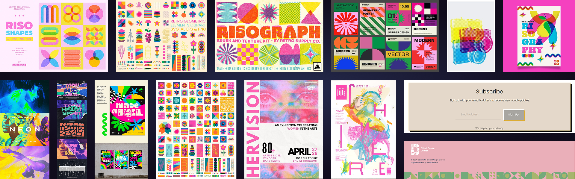
Our team styled the wireframes individually with our own interpretations of the brand guide to offer several perspectives to our client. I was inspired to use geometric patterns from the Diboll Design Center’s site. It’s a subsidiary of Loyola that Professor Marx told us to ensure Niche’s brand is cohesive with it. Because our school often makes riso-printed designs, I made use of saturated duotone imagery and paper textures. These textures would make the site feel tactile and emphasize the craft of Niche’s products.
Asset Iterations
During group critiques, my visual direction was well-received. However, I got feedback that the patterns on the product and review cards were distracting, reducing legibility and potentially hurting sales. I addressed this in my final iteration, keeping patterns in the background and having small type over soft gradients. This gave the same impression while drastically improving clarity.
final
Competitor Comparison: Etsy
While Niche's products could easily be sold on a site like Etsy, Niche's brand image was crucial to establishing it as design leader of Louisiana. The design choices in my prototype target Niche's goals in a way that wouldn't be possible on another site.
reflection
Niche's unique brand and position as an upcoming e-commerce site made it interesting to design for. By carefully considering our questions, our team received valuable insight into Niche's needs from Professor Marx. When designing the layout, I realized that gaining user trust was especially important for Niche to establish a presence online and designed the review and social media post sections accordingly. I believe I was also able to get many aspects of the brand identity across with my prototype's visuals.
Despite this, I think there was more opportunity to incorporate aspects of the brand like wit and self-awareness. The importance of Niche's New Orleans identity could have also been described in more than just a single section. If I continued working on the project, I would have liked to see these aspects in imagery around the site or product descriptions.
Toward the end of my involvement, the scope of the project shifted drastically. Our team realized we wouldn't have the time to pick a final design or start creating the site in Squarespace as we had planned, so we just refined our prototypes for our client to choose from. As we later found out though, a stand-alone Niche site couldn't be funded anyway. Instead, it would likely just be a single page on the Loyola design website. If we continued working on the project, this would force us to heavily reconsider our feature priorities and layout. This experience showed me how quickly a project’s scope can shift and the importance of staying flexible.