trader joes trader joes trader joes trader joes trader joes trader joes
trader joes trader joes trader joes trader joes trader joes trader joes
On-Brand
Usability Test
Journey Map
Pop-Up Shop
Project Type: Mobile App
Year: 2025
Software: Figma
Trader Joe's stores are small and often become crowded during peak hours. The combination of high customer traffic and full-sized carts creates congestion that makes navigating aisles difficult. As a result, customers experience frustration while shopping. This crowding undermines Trader Joe's otherwise enjoyable and distinctive shopping experience. Customers who visit primarily for unique or specialty items may reconsider their trips due to the stress of navigating crowded stores.
research
To explore opportunities related to Trader Joe's, I helped create and distribute a survey to 8 Loyola University New Orleans students, including one Trader Joe's crew member. Using the responses, my team conducted a thematic analysis and identified the following key insights:
Customers visit primarily for unique products and frequently make impulse purchases.
Unclear product availability causes frustration when items are out of stock or discontinued.
The stores can be difficult to navigate because they are small and get crowded.
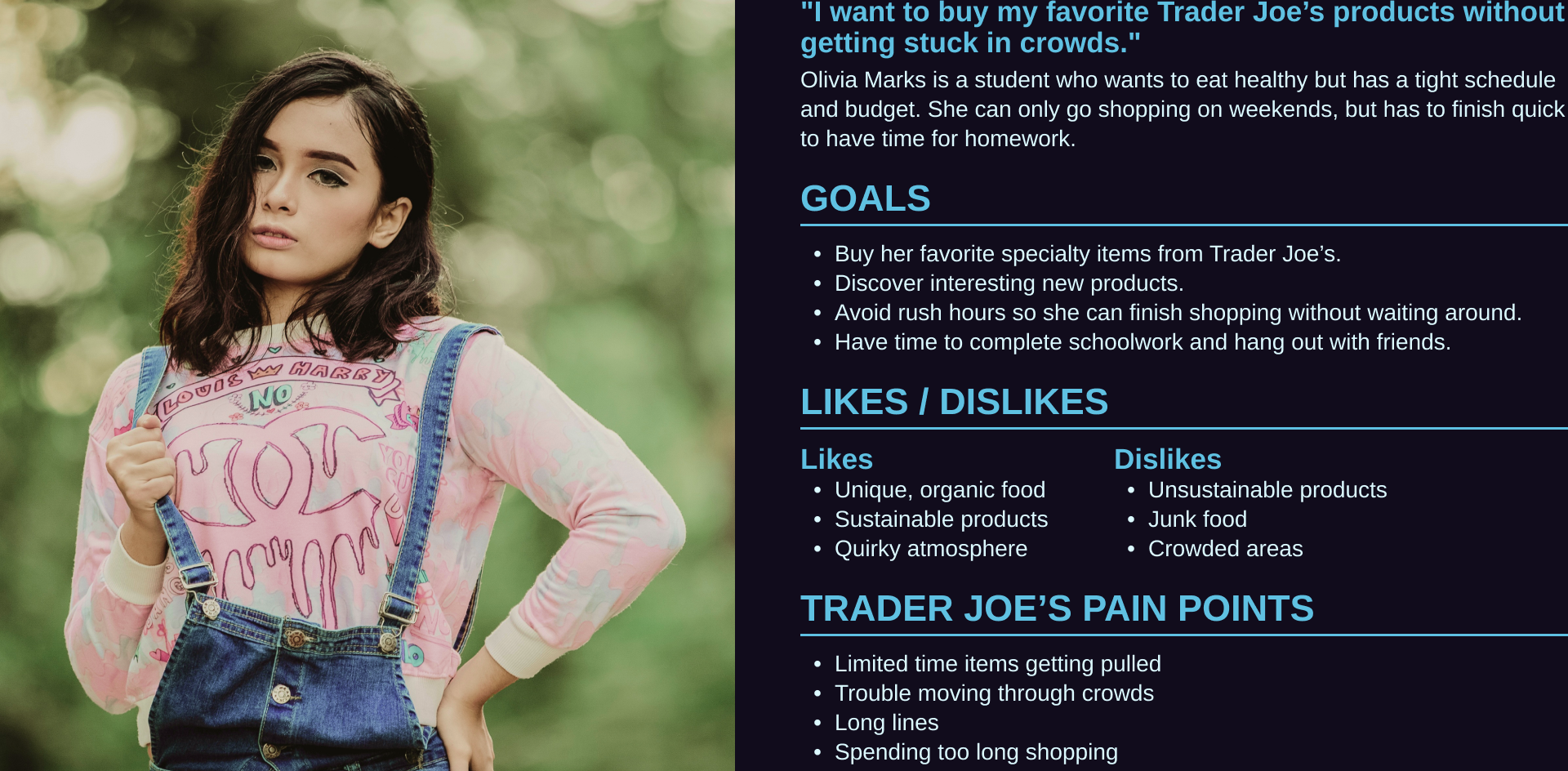
Shopper persona
journey map
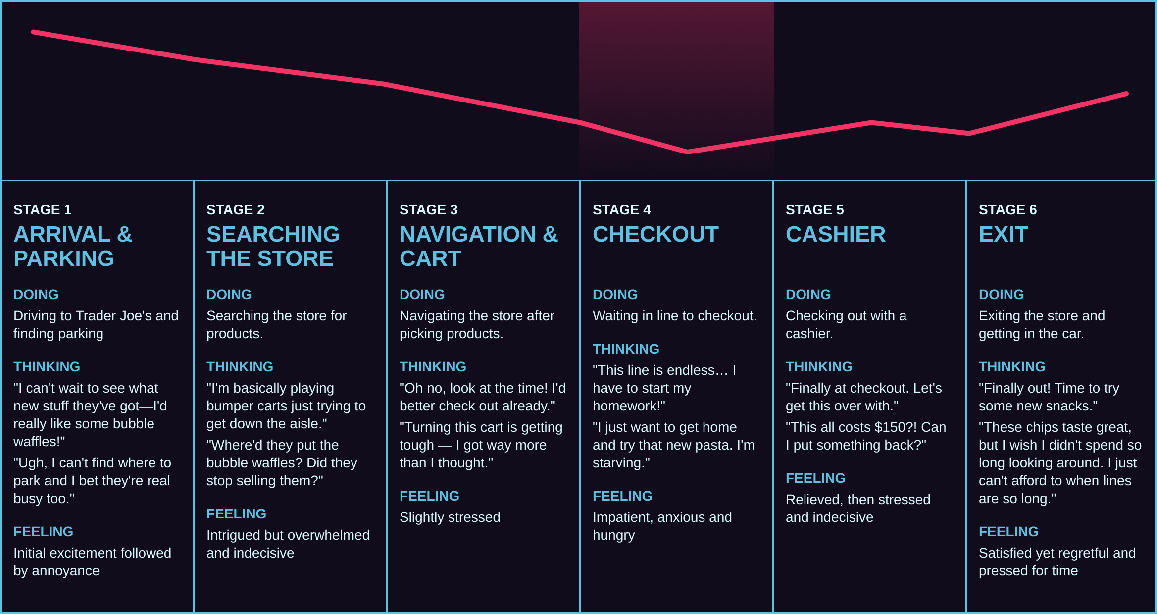
I mapped Olivia's typical Trader Joe's visit across six stages to identify where the experience breaks down and why. The lowest point of the experience is during checkout, where the busyness of the store impedes Olivia most and aspects like interesting branding and products aren't as impactful.
solution
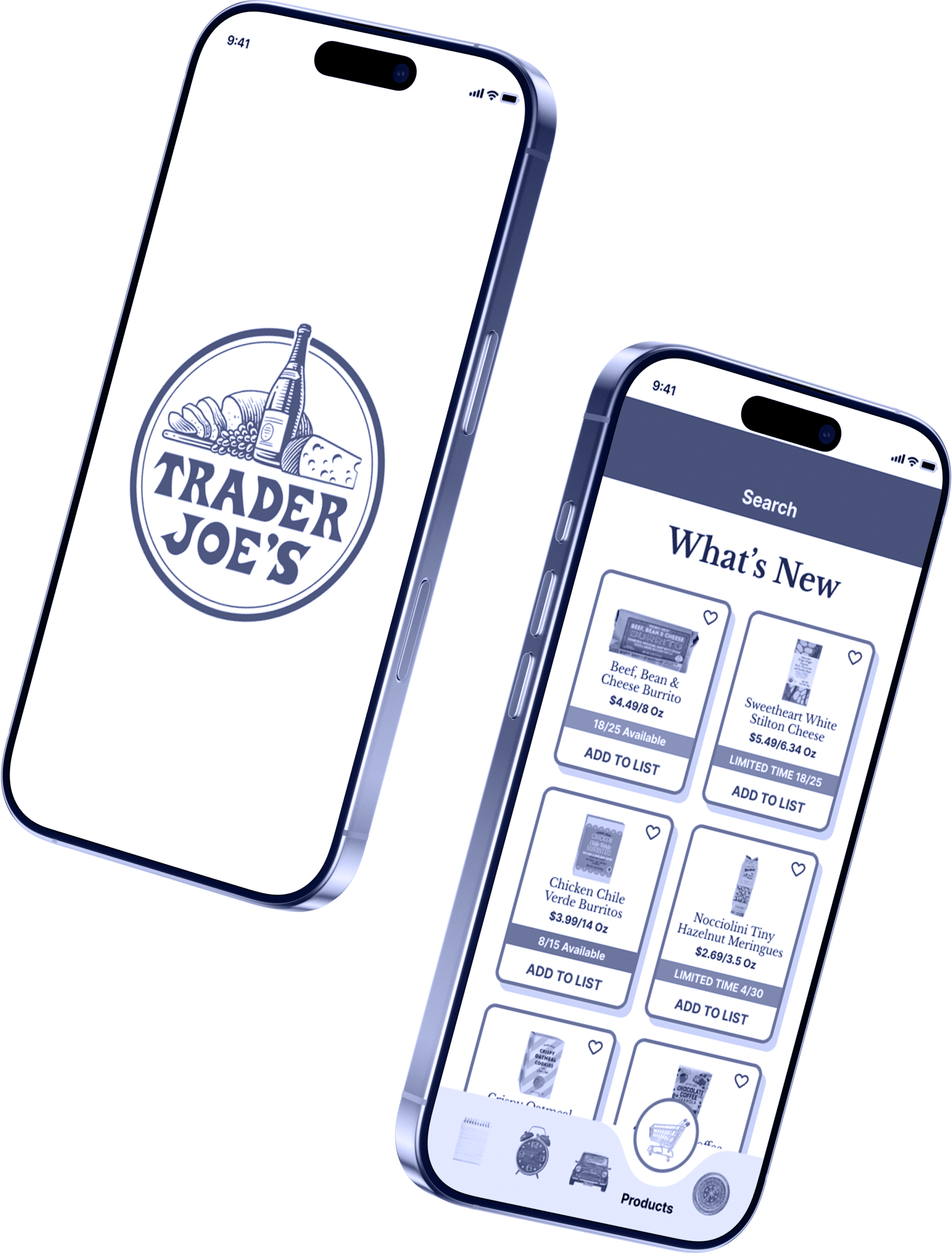
My design solution is an app that reduces shopping stress by giving customers the information they need to decide when to visit Trader Joe's. By setting their store location, users can check how busy it is and what products are in stock. This helps customers avoid surprises like unavailable products and large crowds. Shopping during less busy times also means faster checkout, negating the biggest frustration of a crowded store experience.
development
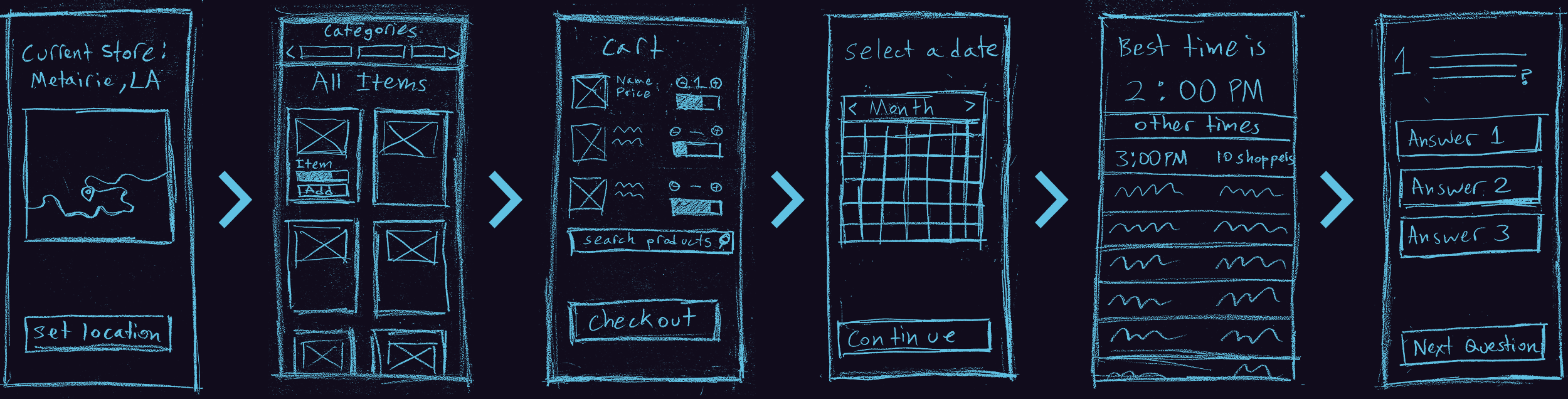
I started by planning my main screens. These sketches show my initial design for the app. The user flow is similar to the final prototype, but the trivia game at the end highlights a difference in my project's priorities. Early brainstorming explored two paths: making the crowded experience more enjoyable, or reducing in-store traffic. While concepts like gamified checkout rewards or trivia were interesting, they would have made the shopping experience more complex and slowed it even further. I pivoted to a more impactful solution, which was to help customers avoid peak hours entirely instead of trying to transform behavior inside a crowded store.
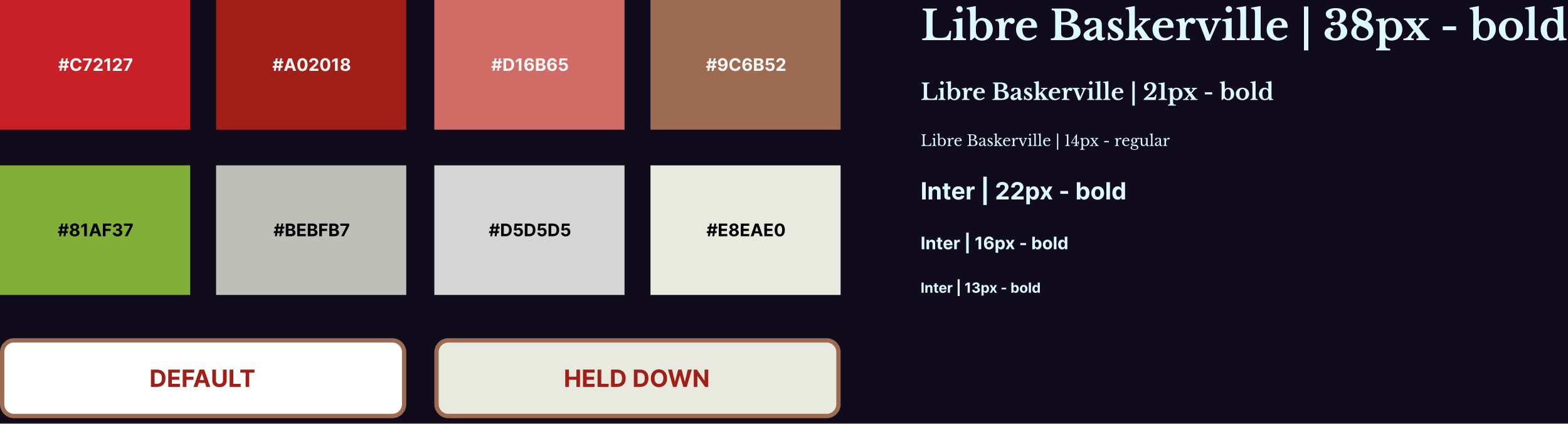
style guide
I based the colors, typography and icons on the existing Trader Joe's website for brand consistency.
User Testing Changes
I conducted usability testing with five students with a high-fidelity Figma prototype. Participants completed six tasks covering core features: setting a store location, checking busyness, adding items to a shopping list, using product filters, and scheduling a visit. After the tests, I revised the app based on the feedback I received.
final
Pop-Up Shop
I helped set up a pop-up shop exhibition in collaboration with our local Trader Joe's. It featured various interactive activities themed around the brand, including my app. Visitors could scan a QR code with their phones to use the Figma prototype. I assisted with planning and setting up the exhibit, as well as showing visitors how to play our Trader Joe's games.
reflection
Using survey results, I was able to identify and address a key issue with the Trader Joe's shopping experience. Real-time notifications and store-specific information provide enough value to justify the app. This project also strengthened my understanding of mobile UX patterns and user expectations.
While I incorporated much of the usability feedback, there are opportunities to improve. For example, replacing the scheduling interface with a traditional bar graph would make peak shopping hours easier to understand at a glance. Adding text labels beneath the navigation icons would also improve clarity, especially for older users who may hesitate to tap unfamiliar icons. Designing for shoppers of all ages means prioritizing clear, intuitive navigation.