great ideas great ideas great ideas great ideas great ideas great ideas
great ideas great ideas great ideas great ideas great ideas great ideas
Scalable
Iterative
On-brand
Teamwork
Project Type: Mobile App
Year: 2025
Software: Figma
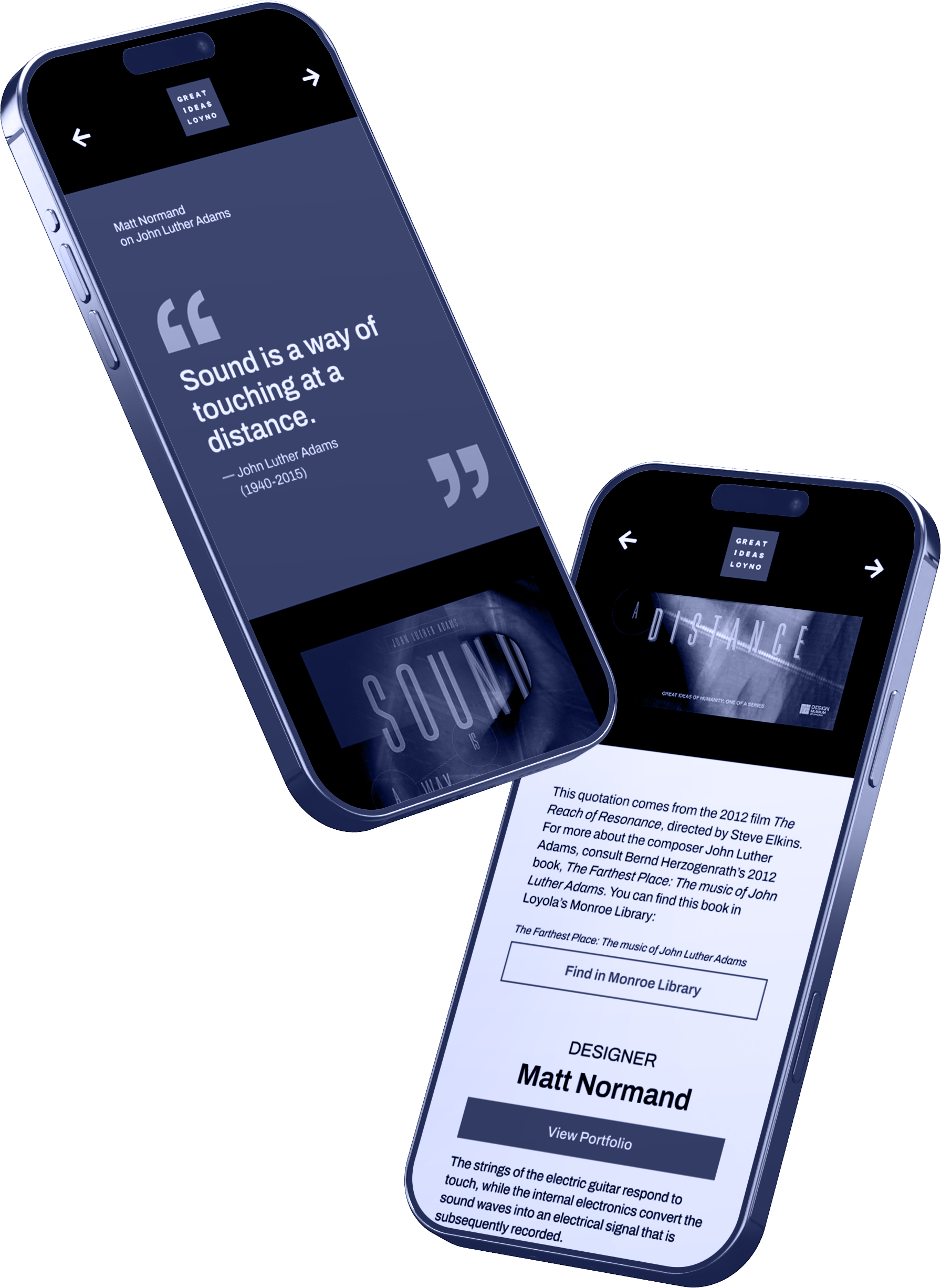
Our team worked with Professor Benjamin Benus on behalf of the Design Museum of Chicago to develop an app for a design exhibit. The exhibit, coming to Loyola University New Orleans, would showcase over 50 posters related to profound quotes from around the world. Our app needed to provide visitors with context about the quotes, posters and designers. It also had to link to library pages and designer portfolios. Our main challenge was finding the best way of organizing the content while making sure all the screens looked consistent and refined.
Development
Because our client already determined the content, our team focused on style and hierarchy. We leveraged our large group size to discover our final layout through sheer iteration.
moodboard
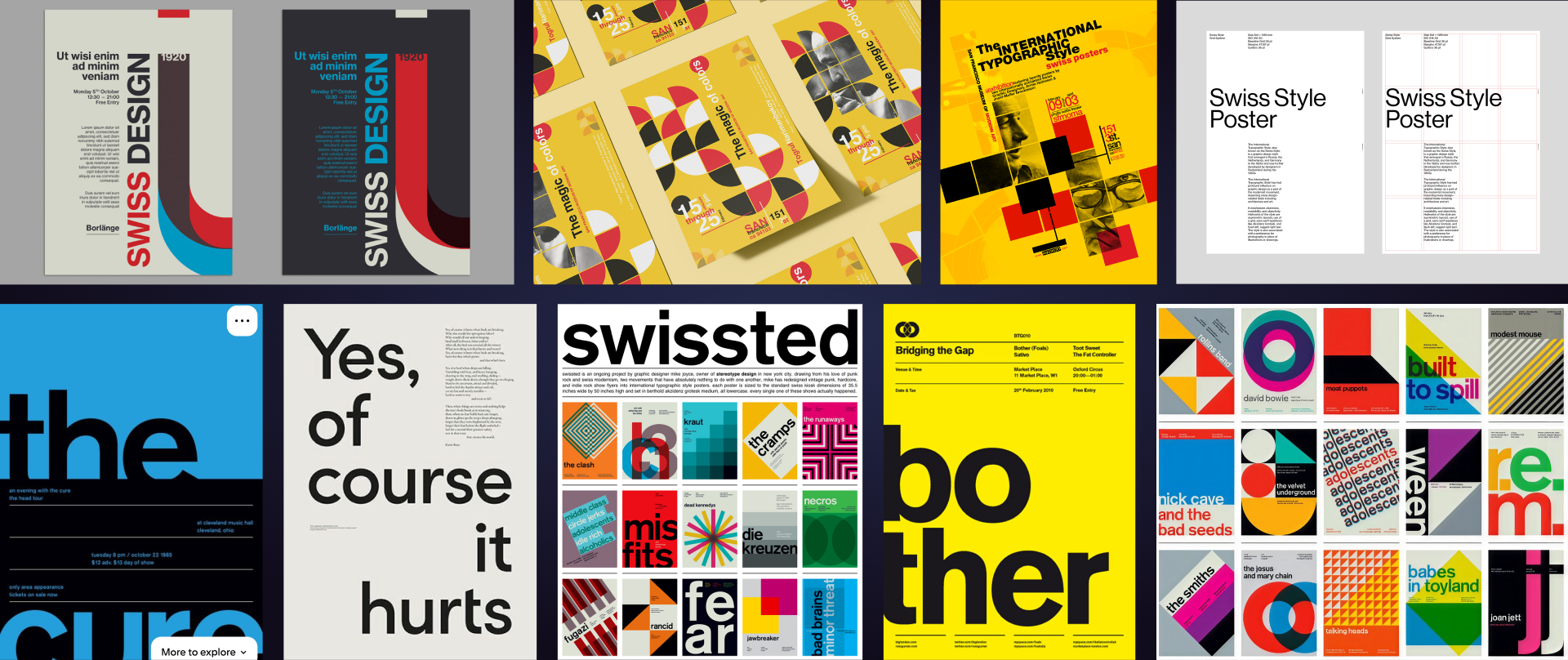
Seeing as the museum's brand was inspired by Swiss design, I looked into examples to see what could be worked into my screens. Asymmetry, lowercase type, geometric shapes, saturated colors, narrow text, hyphenated words, and large headers were all stylistic choices in my initial iterations that I based on this.
Iterations
The initial layouts were distinct and bold, but not exactly practical. The colors were too saturated, background elements were overly complex, and body text containers were too narrow. All of this hurt legibility and distracted from the posters. I gradually simplified the designs and incorporated the brand colors when we received them. However, the more I refined my designs, the less Swiss they began to feel.
User Testing
To evaluate our designs, we conducted in-person testing with another class of design students. We asked them to write feedback and vote on their favorite design. To reduce bias, each design was anonymous.
The reception I got was mixed. Some disliked the narrowness of the portraits and others thought the lowercase text was a mistake rather than a deliberate nod to Swiss design. Even after heavily simplifying my designs, there was still concern about them being too detailed to function as a template.
Because of this, I revised my designs again and made them more simple and traditional. Per instructor feedback, I also modeled my quote section off another colleague's to give it more importance.
client meeting
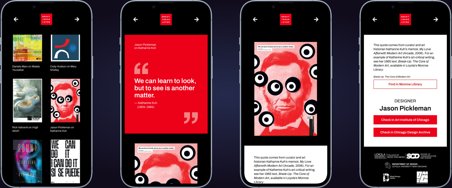
We had a meeting with Professor Benus to determine the direction of our final design. My version ended up being chosen for two reasons. First and foremost, it adhered most strongly to the branding. My peers didn’t use the red our client wanted as it was very saturated, but I was able to incorporate it tastefully by limiting it to the quote section and buttons. My quote section was similar to signage from the exhibit too.
Second, my layout made the most sense for the project. Visitors would naturally focus on the large posters and not the tiny captions with the author quotes at the exhibit. However, the quotes were important for understanding the posters. Therefore, emphasizing the quotes as I did was crucial.
final
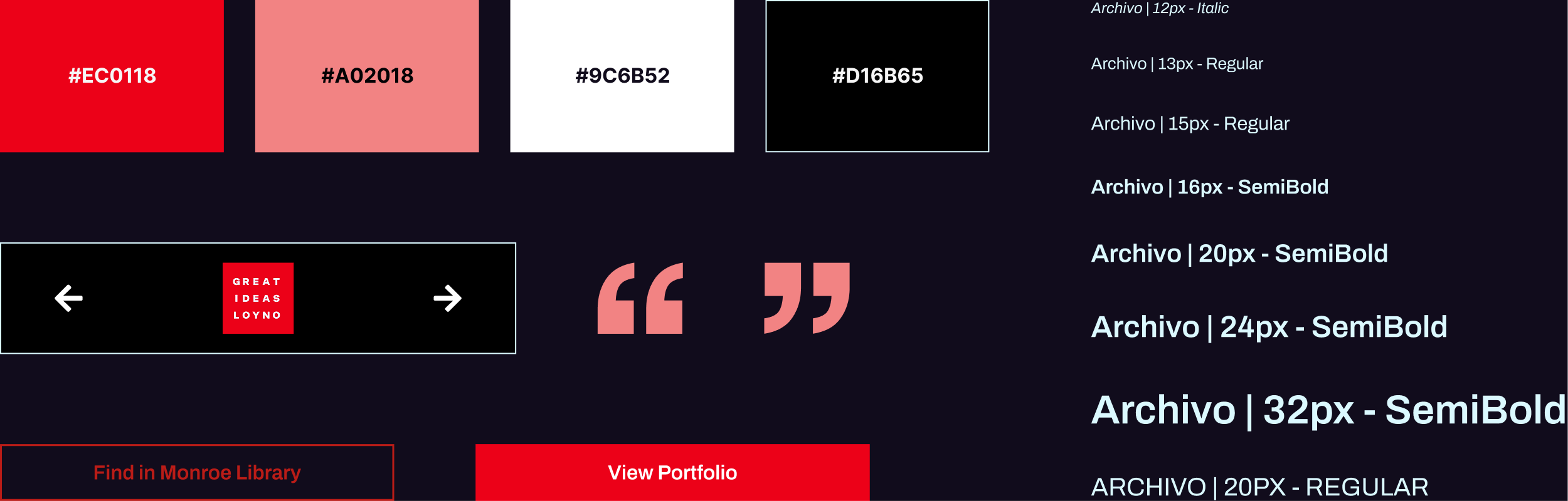
With our design decided, our team focused on styling and reproducibility. We split up into three teams: transferring text, creating a style library, and refining the layout. This approach allowed us to work quickly without getting in each others way. As part of the layout group, I made screens responsive, ensured spacing consistency, and integrated library styles.
reflection
Our team successfully completed all the screens before the launch of the exhibit, ensuring that the content was correct and everything functioned as intended. Through this experience, I gained experience with creating flexible templates and learned how a team can be effectively organized.
While Swiss design works well for posters, I found it was not well suited for this project. Narrow type, oversized headers and complex layouts reduced readability on mobile and made responsive design more difficult. Simplifying the interface ultimately created a stronger experience for the exhibit. Even so, I don't regret experimenting early in the process. Exploring bold concepts encouraged innovation, and the many design iterations allowed me to refine those ideas into a more practical solution.