The problem
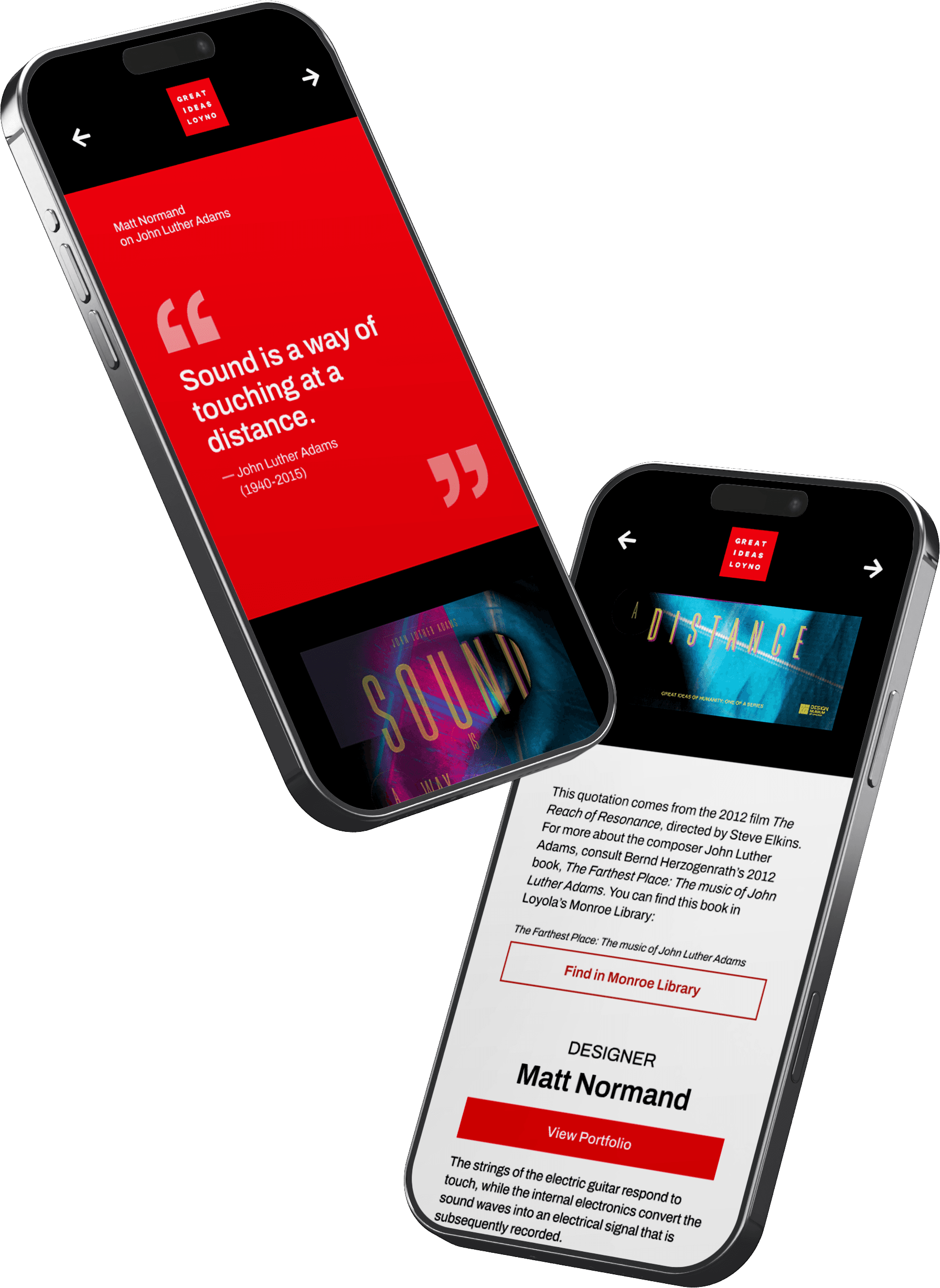
Visitors to a traveling design exhibition needed an easy way to access context behind each poster—especially the quotes, designers, and source material. At the same time, the experience had to work seamlessly on mobile via QR codes and remain consistent across 50+ pieces of content. The challenge was designing a system that balanced clarity and visual hierarchy while remaining easy to update and reuse.
iterations
I focused on creating a mobile-first, template-driven system that prioritized readability and hierarchy. I emphasized the quote as the focal point and used clean, structured layouts for easy scanning. I shifted from experimental Swiss-inspired visuals to a more minimal, functional approach that incorporated the museum's branding.
Round 1
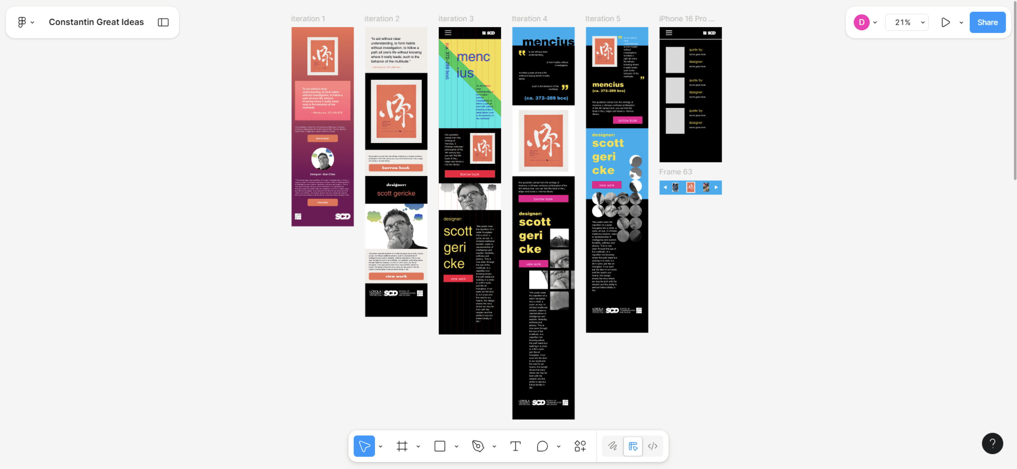
I experimented with Swiss design elements (asymmetry, bold colors, narrow type). While visually distinct, these designs introduced readability and complexity issues.
Round 2
I simplified layouts, widened text blocks, and adjusted color palettes. Despite improvements, the designs lost clarity and remained difficult to scale responsively.
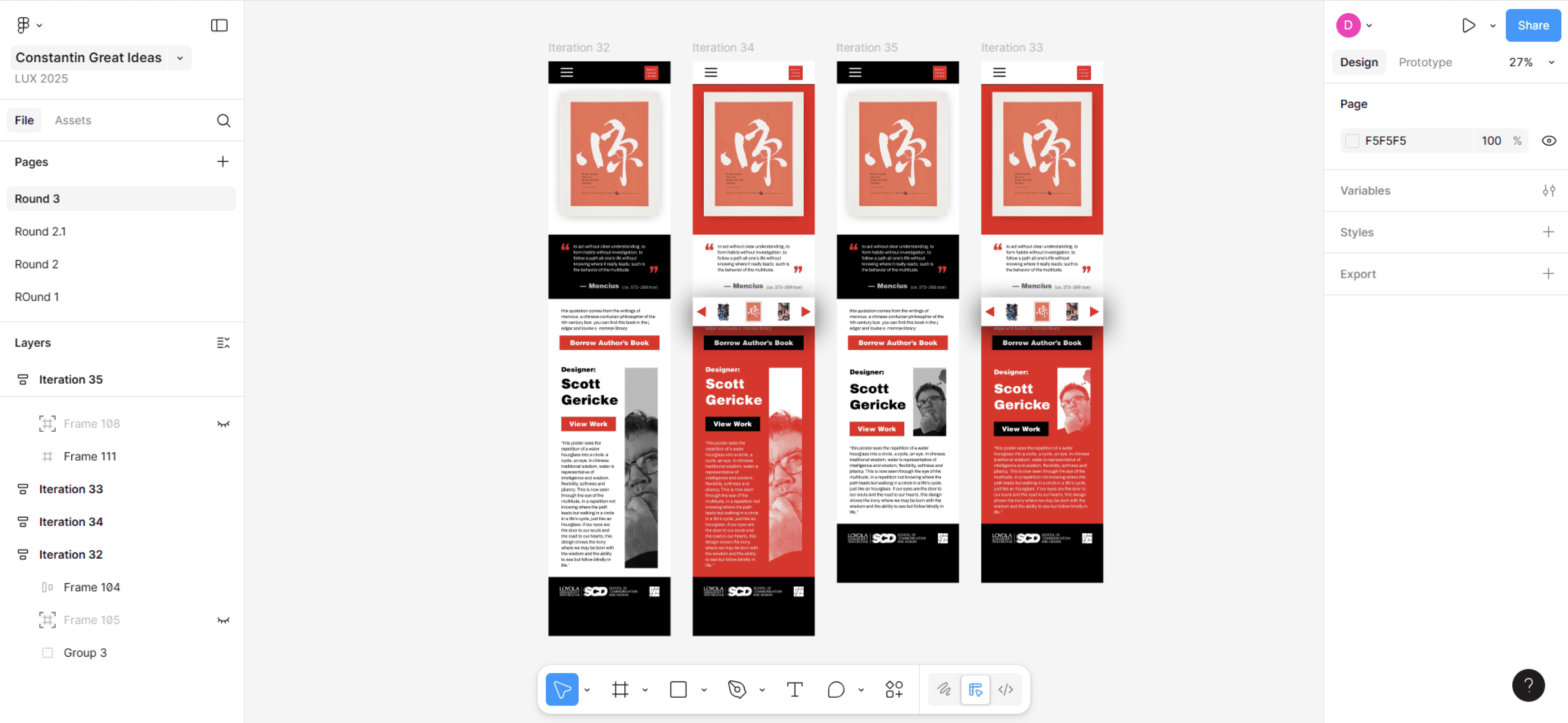
Round 3
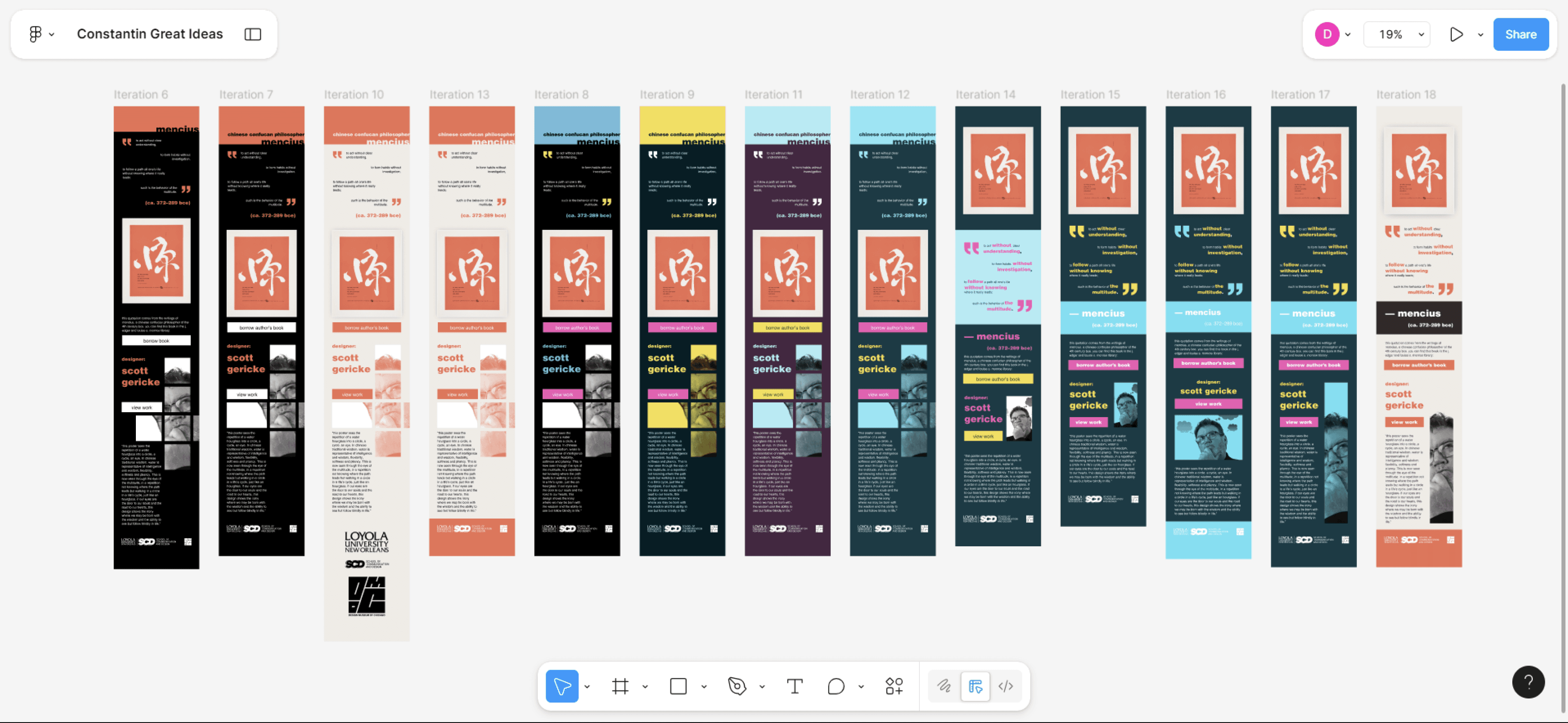
I refined the layout by widening text columns, simplifying background elements, and adjusting the color palette to improve readability and visual balance. These changes created a cleaner, more structured design while maintaining a distinct visual identity.
User Testing & Changes
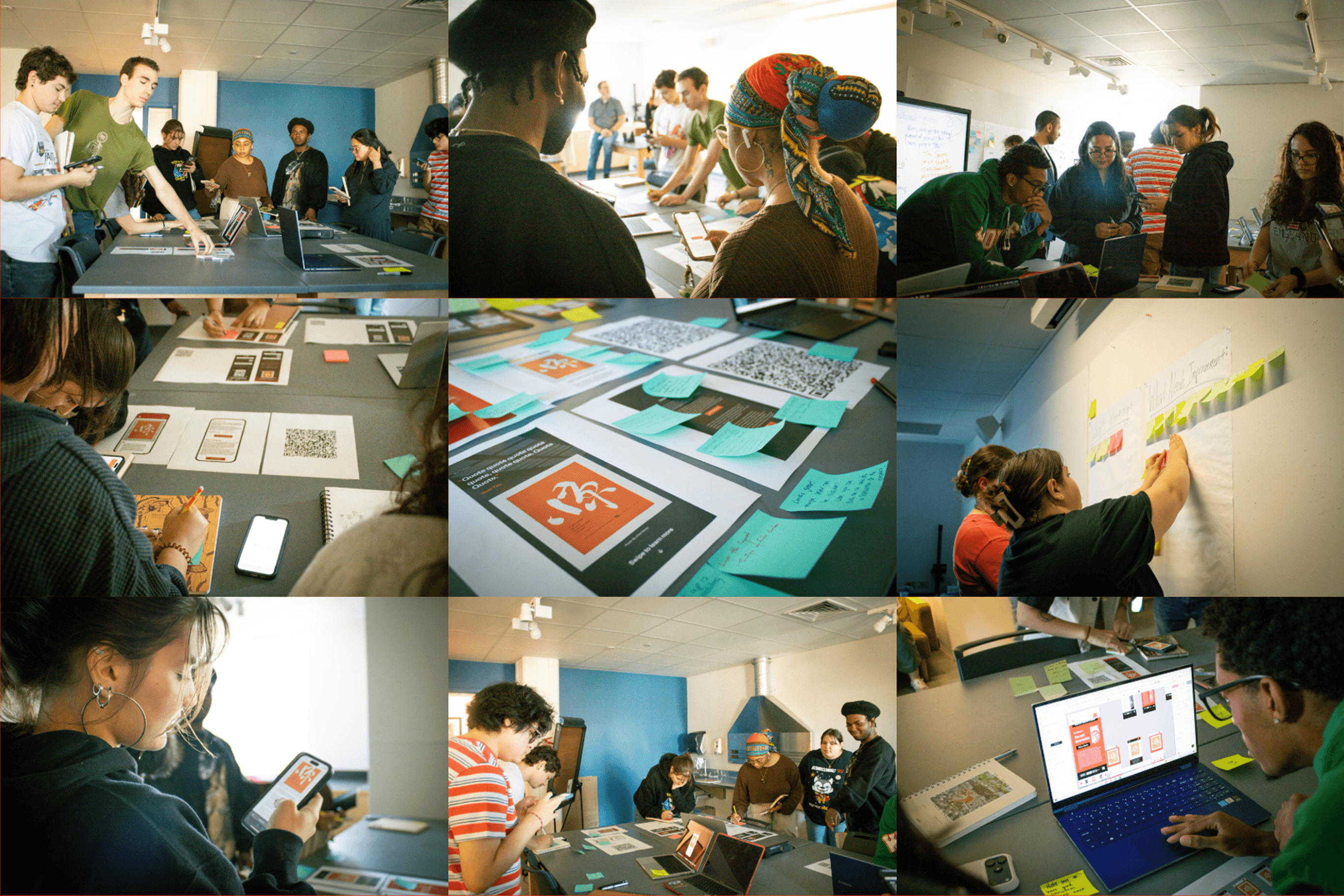
To evaluate our designs, we conducted in-person testing with a class of design students. We placed QR codes linking to each prototype and asked participants to explore the screens on their phones, leave written feedback, and vote on their preferred design. To reduce bias, each design was anonymized.
Problems
Changes Made
The lowercase text was seen as a mistake rather than a deliberate nod to Swiss design.
I replaced the all-lowercase typography with mixed-case text to align with user expectations and improve clarity.
Scalability concerns became apparent as participants noted the designs may still be too complex to work across dozens of screens.
I simplified the layout to create a more flexible, repeatable template that could scale across many screens.
The narrowness of the portraits and text made content feel compressed and harder to scan on mobile screens.
I widened text columns and removed the portraits to improve readability and create a legible layout on mobile.
features
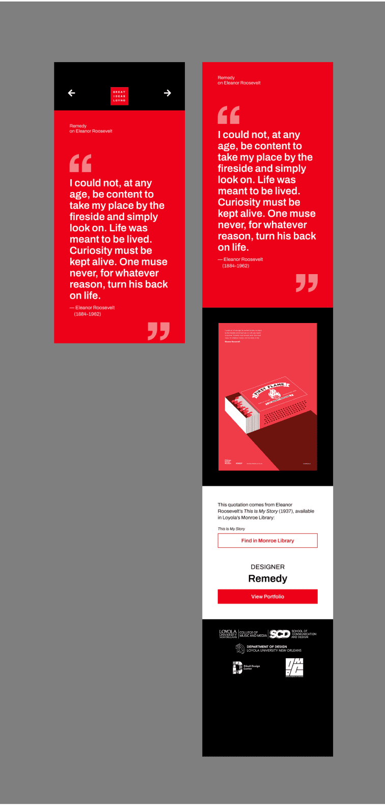
The final concept is an app designed to reduce shopping stress by giving customers the information they need before ever leaving home.
access to designer portfolios and library books
Large, high-contrast quote section to reinforce poster meaning
descriptions to learn more about the designers and authors
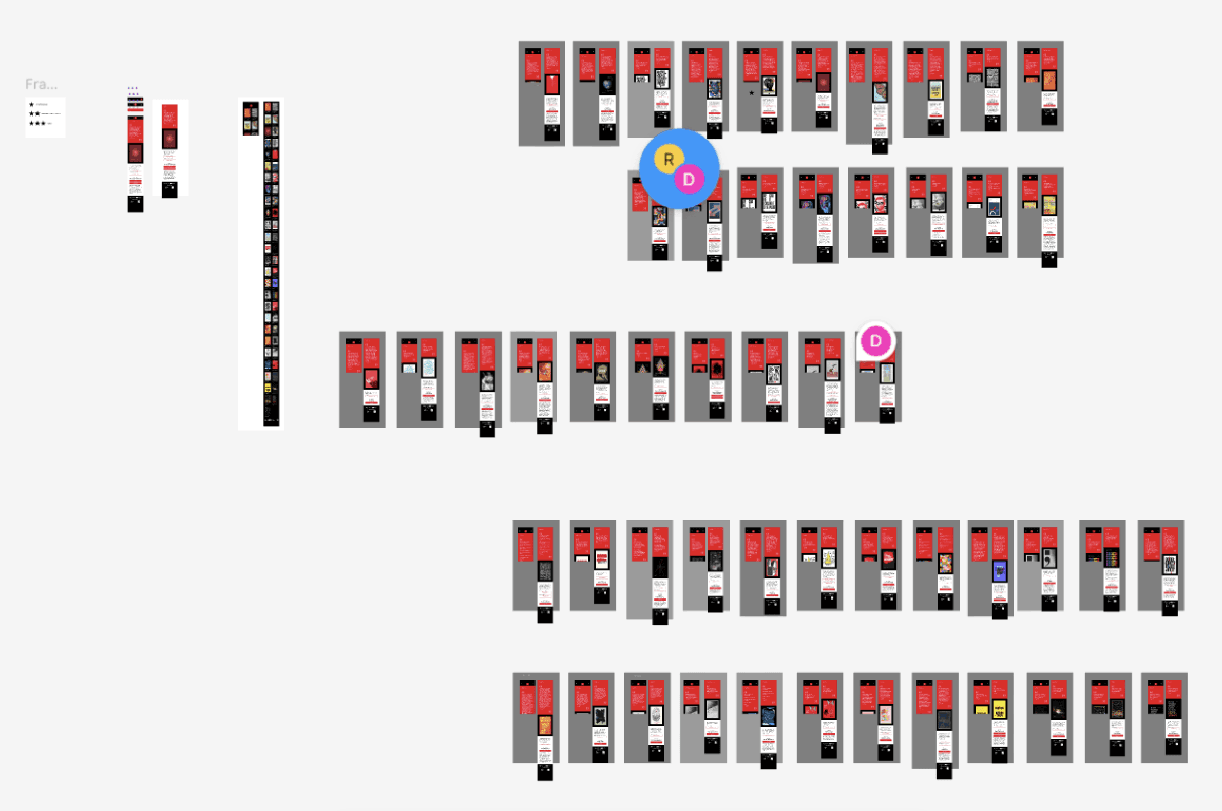
scalable, Modular Template System
final version

Reflection
I learned that usability and clarity are more important than stylistic experimentation on mobile, and that strong systems and teamwork are essential for creating scalable, effective designs. Moving forward, I would prioritize responsiveness and establish a design system earlier to reduce rework and improve consistency.
What I learned
Usability outweighs stylistic ambition, especially on mobile.
Strong systems (components, properties) are essential for scalable design.
Iteration and critique are critical—even unsuccessful concepts move the work forward.
Effective teamwork requires clear division of roles and shared systems.
What I'd Change
Prioritize responsiveness constraints earlier in the design process.
Establish a design system sooner to avoid rework later in the process.